
Pantone has just announced its colour of the year 2026: “Cloud Dancer”, a soft white shade symbolising new beginnings and minimalist clarity.
Every year, Pantone selects a new colour of the year. After the warm, earthy brown of “Mocha Mousse” (2025) and vibrant tones like “Viva Magenta” (2023), 2026 marks a new direction: the soft white hue “Cloud Dancer” stands for calm, new beginnings and minimalist clarity.
Discover what this means for interiors, colour trends and living spaces and how you can subtly evolve or reimagine classic interior colours.
Pantone colour of the year 2026: Cloud Dancer
Pantone’s colour of the year 2026 is Cloud Dancer (PANTONE 11-4201). With Cloud Dancer, Pantone has chosen a shade of white for the first time since launching the colour of the year—a conscious move towards serenity, clarity and fresh starts.
As is well known, the colour of the year is anything but a random choice. The selected shade reflects the current social mood. In a fast-paced, overstimulated world, Cloud Dancer expresses a desire for clarity, new beginnings and mindful design. Laurie Pressman, Vice President of the Pantone Color Institute, describes the hue as “[…] a blank canvas […] that opens space for creativity, allows the imagination to flow freely […]”.
Cloud Dancer is a “lofty white neutral” with a soft, airy presence. A tone that radiates calm and serenity while serving as a subtle backdrop for creativity and personal expression.
In interiors, architecture and home design, this means Cloud Dancer can be used as a foundation. Whether in minimalist, modern designs or spaces that incorporate bold colour accents and natural materials. The soft white hue harmonises beautifully with vibrant colours and warm natural tones, bringing a sense of calm and elegance.

Pantone colour palettes featuring Cloud Dancer: subtle harmony and versatile combinations
Alongside the announcement of Cloud Dancer as Pantone’s colour of the year 2026, the spotlight also turns to the seven accompanying colour palettes. These demonstrate how versatile this soft off-white can be, and the mood it creates when paired with other shades. Pantone presents several curated palettes in which Cloud Dancer serves as a calming, grounding element.
In the palette “Light & Shadow”, for example, the hue reveals its softest side: it meets light, washed-out tones that blend into shadow-like gradients. Cloud Dancer adds gentle contrasts that feel subtle and effortless.
“Atmospheric” highlights the ethereal quality of this white. Muted blues, greens and purples—evoking mist, sky and auroras—form a harmonious backdrop, further brightened and balanced by Cloud Dancer.
The palette “Tropic Tonalities” is much more vibrant: bold tones like pink, kiwi or coral are tempered by Cloud Dancer, creating a contemporary balance between energy and calm. Here, the off-white shade acts as a neutral anchor, giving even expressive colours space to breathe.
Discover the characteristics and effects of the seven Cloud Dancer palettes:

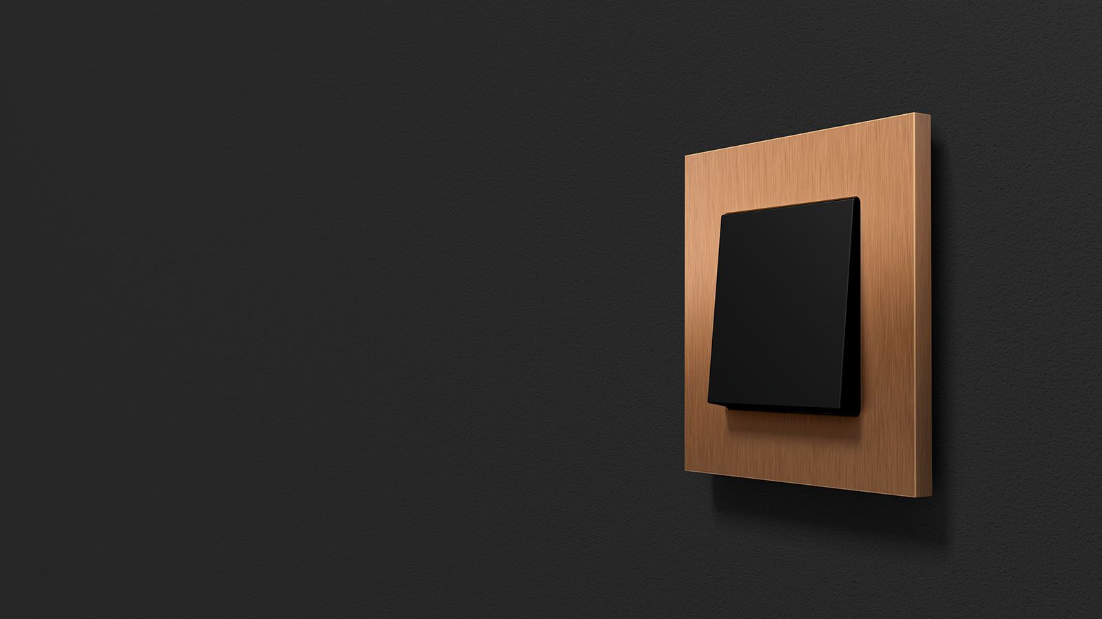
Interior design also reveals how seamlessly this hue can be combined with clean, timeless switch designs: Gira E1 in pure white matt blends harmoniously into the pastel and atmospheric palettes thanks to its understated design language, while the Gira F100 in pure white glossy acts as a purist element that complements the calm aesthetic of Cloud Dancer and elegantly accentuates its soft nuances.
Together, these palettes show just how versatile the colour of the year 2026 can be. Whether as a subtle stage for pastel tones, a grounding element in atmospheric colour worlds or a balancing component in bold, tropically inspired combinations.
With Cloud Dancer, Pantone offers a broad creative base for interior, fashion and design concepts in the coming year – defined by timeless clarity and gentle elegance.
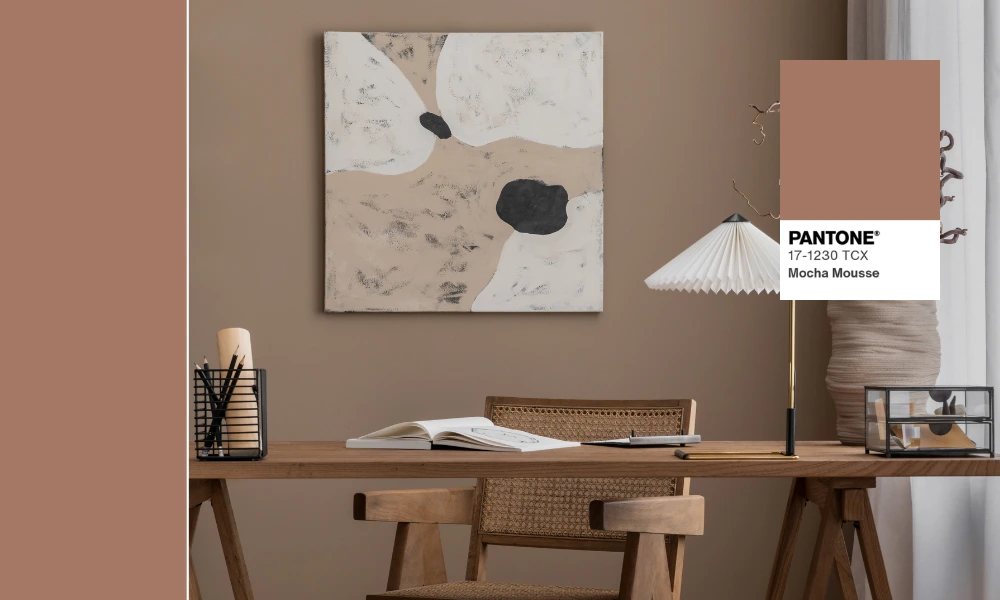
Colour of the year 2025: Pantone “Mocha Mousse”
According to Leatrice Eiseman, Executive Director of the Pantone Color Institute, Mocha Mousse blends down-to-earth simplicity with a touch of luxurious glamour. The soft brown radiates a natural warmth that evokes comforting moments like wrapping yourself in plush velvet or enjoying a hot cup of coffee on a cold morning.
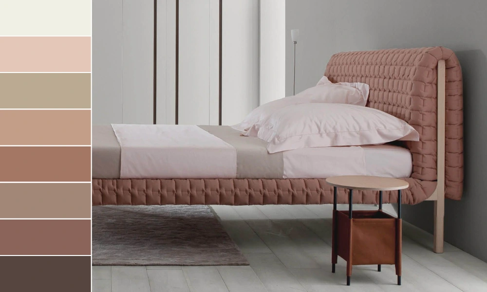
The Mocha Mousse colour palettes
Five curated colour palettes showcase the versatile ways Mocha Mousse can be combined and styled.
With shades of beige, cream, taupe and brown, the “Relaxed Elegance” palette creates a harmonious foundation that conveys calm and understated sophistication. This palette is ideal for designs that aim to make a quiet yet impactful statement.
“Floral Pathways” pairs floral hues with the warm tones of Mocha Mousse. The palette conjures the image of a stroll along cobbled streets, flanked by shaded willows and blooming flowers – perfect for romantic and nature-inspired designs.
The “Uniquely Balanced” palette creates a vibrant yet harmonious mood through the contrast of opposites. Mocha Mousse is set alongside a blend of warm and cool tones.
“Deliciousness” combines the 2025 Pantone Colour of the Year, Mocha Mousse, with sweet and creamy shades inspired by confectionery. This palette is ideal for sensual and opulent design concepts.
“Subtle Contrasts” mixes refined brown tones with soft blues and greys. This combination lends a contemporary edge to classic designs, offering a subtle yet striking modern twist.
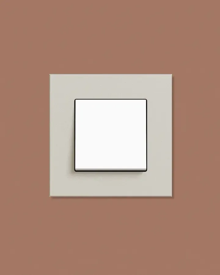
With the new colour palettes from Dulux directing a firm focus on the natural world, you can round off the trend colour of the year 2023 on the wall in style by combining it, for example, with the Gira Esprit linoleum-plywood design line. The natural materials used for these switches and socket outlets ensure they complement 2023’s earthy colour trend perfectly.
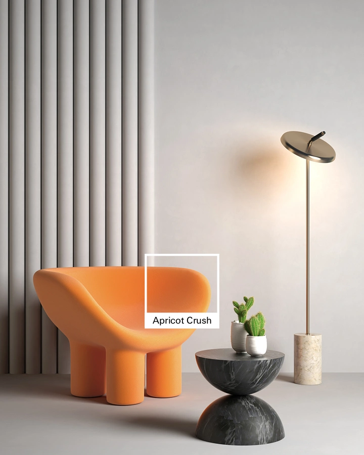
Colour of the year 2024: Apricot Crush
WGSN first identified Apricot Crush as a key trend colour for the 23/24 season, highlighting a focus on balance and wellbeing, bringing mind and body into harmony.
Now named the colour of the year 2024, Apricot Crush demonstrates that orange remains a relevant and adaptable hue all year round. It embodies health and wellbeing.
Inspired by apricots and oranges, this trend colour celebrates the beauty of nature. In uncertain times, Apricot Crush brings hope and positivity into our everyday lives.
Gira Esprit
Switches from the Gira Esprit design line have a simplistic, yet sophisticated appeal: ✓ various colour shades ✓ natural materials ✓ smart functions.
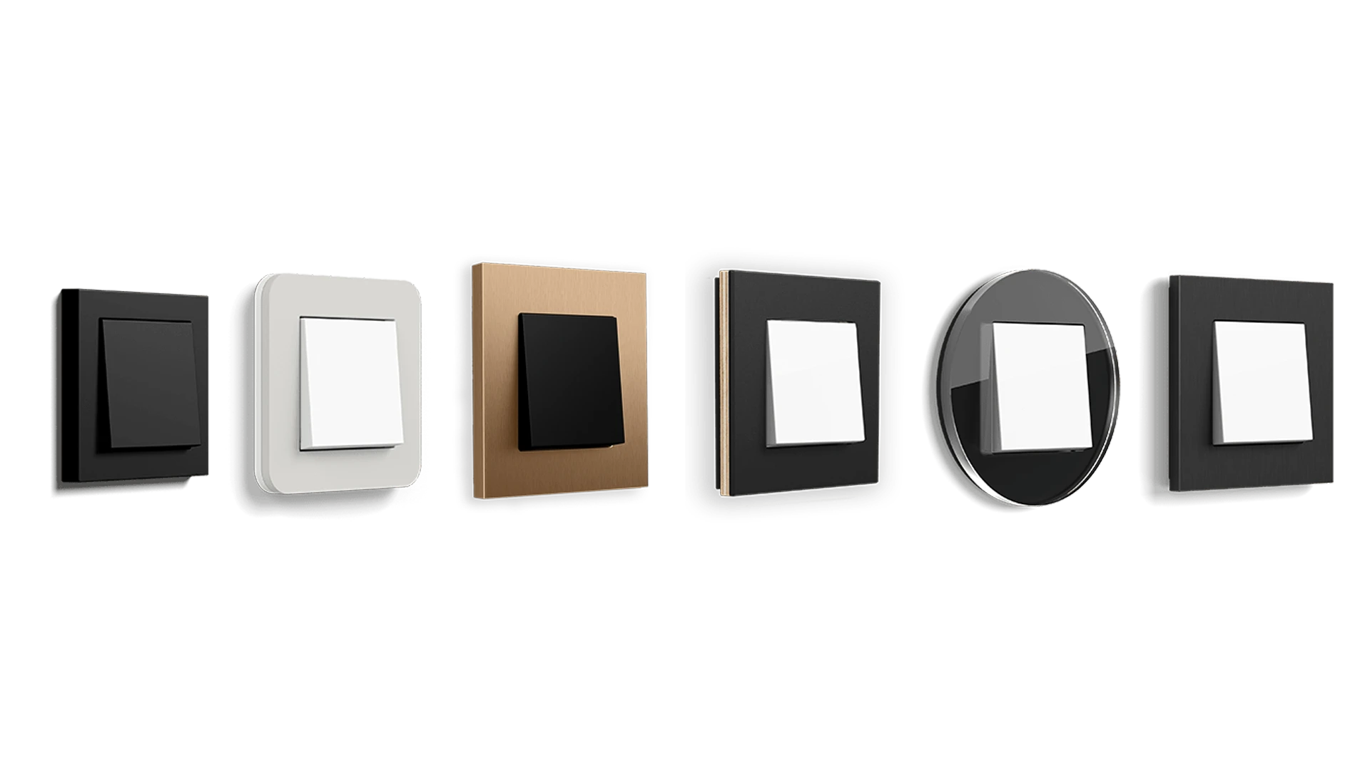
Design in the Gira System 55
Classic or modern, subtle or luxurious? Gira System 55 makes it possible to combine your favourite frame designs as you please. Try it out ➥
Gira E3
Experience the Gira E3. ✓9 colour variations ✓Round ✓Award-winning
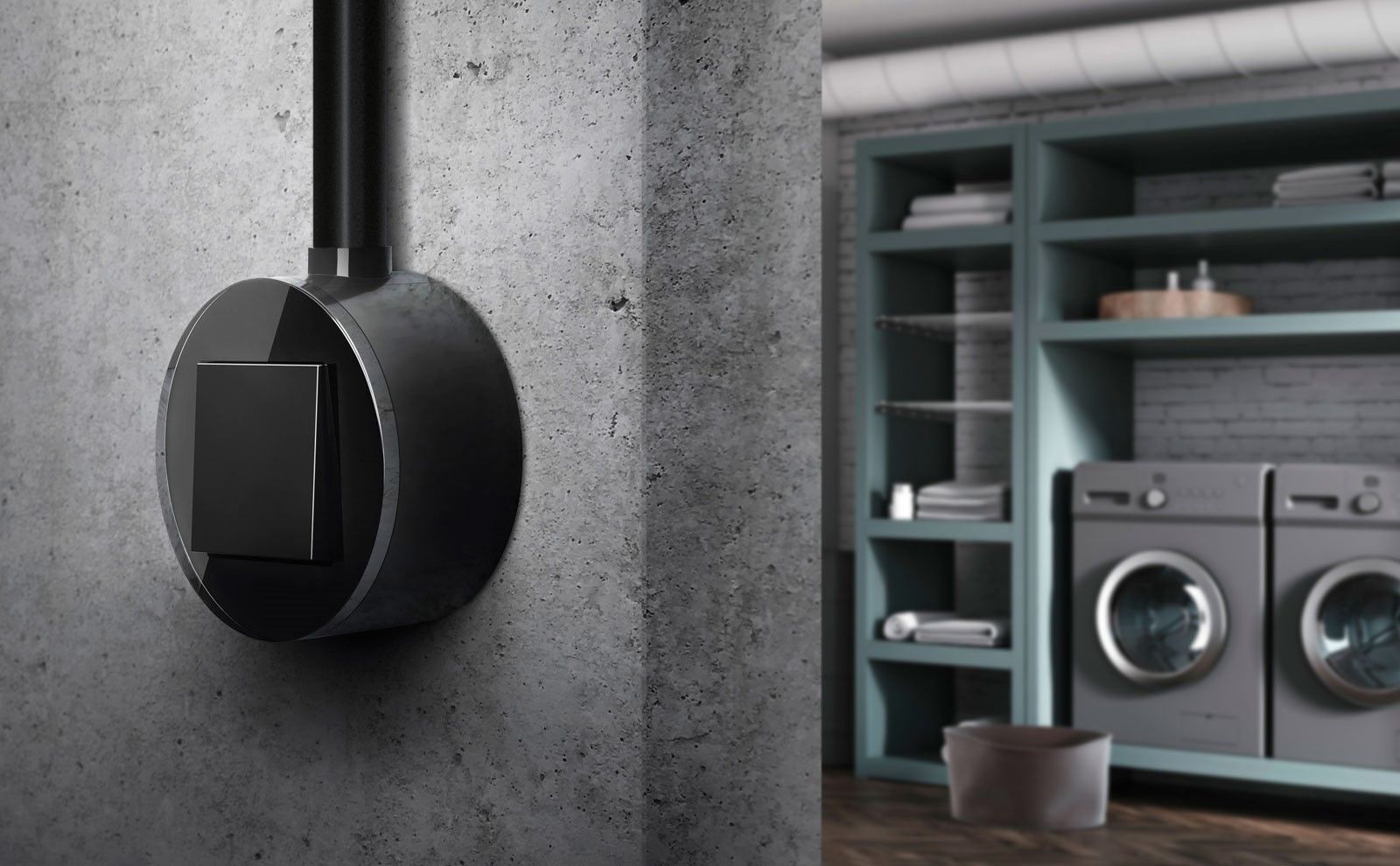
Gira Studio
Never has a design line been more perfectly shaped than our Gira Studio. It embellishes every living space with its soft edges.