Trend colours 2026: butter yellow meets midnight turquoise – how zeitgeist colours your home
Which colours will shape furniture, walls, and interior trends in 2026? Colour institutes such as Pantone, RAL, and Dulux provide the answers and show why butter yellow and midnight turquoise are more than attractive shades: they reflect a new sense of living.
Which trend colours will shape our living spaces in 2026? According to colour experts at Pantone, RAL, and Dulux, two shades take the lead: softly radiant butter yellow and deep-glowing midnight turquoise. Both are far more than a fresh coat of paint. They express a new attitude towards life, bringing warmth and optimism into a room as much as calm and depth.
You may be wondering how these colours could work in your own home. This is where the journey gets interesting, because butter yellow and midnight turquoise reveal what matters to us in 2026, from a sense of comfort and security to a bold, forward-looking mindset.
Trend colours for the home in 2026: how our interiors become real eye-catchers
The interior trend colours for 2026 are defined by balance and diversity. After several years of more neutral palettes, the focus now shifts to earthy warmth, soft pastels, and nature-inspired tones.
At the same time, “neo-neutrals” are emerging. These are neutral shades with subtle undertones that replace classic whites and greys. Leading colour and design institutes such as Pantone, RAL, Dulux, WGSN/Coloro, and NCS offer forecasts that paint a coherent picture:
A deep, atmospheric mood shaped by grounded earth tones and ethereal, gently tinted whites and blues, energised by bold accent colours such as red or fuchsia, and rounded off with nature-inspired blues and greens.
Below, we provide an overview of the trend colours for 2026, their meaning, and examples of colourways and applications in interior design, aimed at anyone who wants to use colour with intention.
In the colour world of 2026, four overarching themes dominate:
Warm earth tones as a grounding base that creates comfort and warmth.
Cool pastels that offer lightness, poetry, and visual calm.
Nature-inspired colours that bring elements of plants and water into the home.
Neo-neutrals that reinterpret classic neutral shades with subtle undertones.
Warm earth tones 2026: why browns and ochres bring warmth into our homes
In uncertain times, many people look for comfort in familiar, earthy colour palettes – a trend also highlighted by experts. “When people feel unsure about the future, they inevitably look to the past,” says Leatrice Eiseman from the Pantone Color Institute.
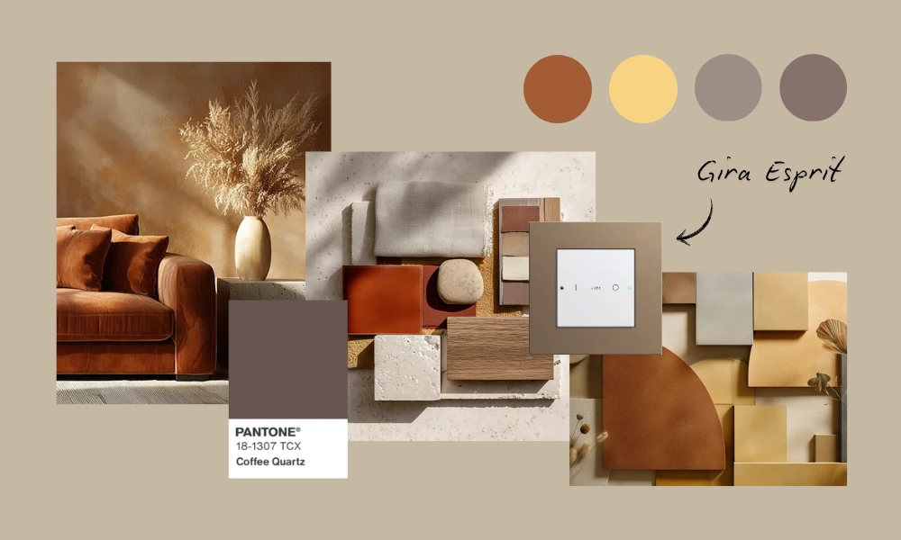
Pantone’s trend colour for 2025, “Mocha Mousse”, a rich, cocoa-toned medium brown, reflects retreat, comfort, and emotional warmth. The development of Pantone’s 2026 trend colour builds on this, expanding into a broader spectrum of earthy, soothing shades.
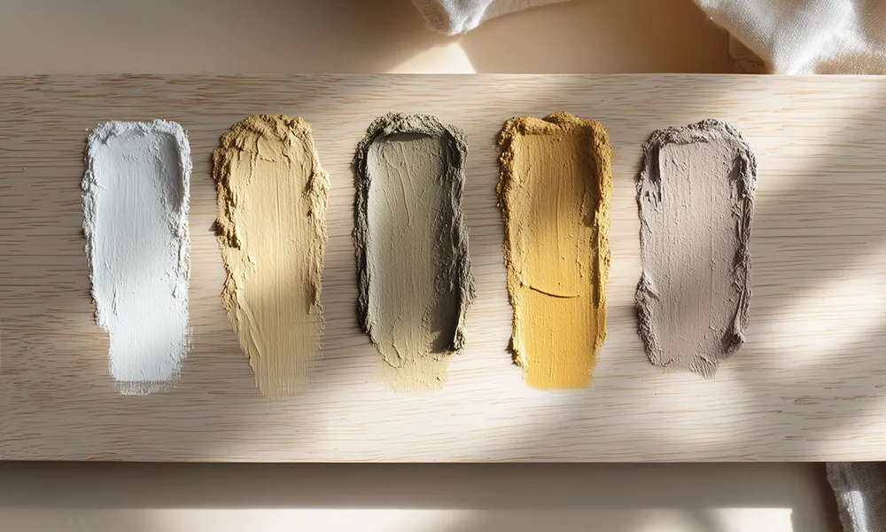
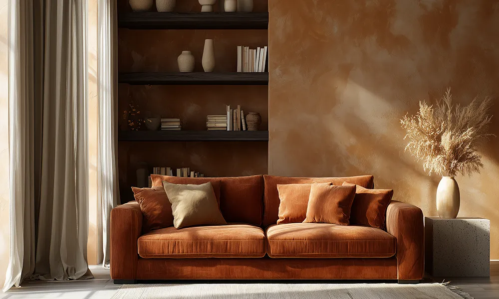
Warm earth tones include colours reminiscent of soil, clay, spices, or sunsets – for example terracotta, rust red, warm oranges and browns, and muted yellows. They create timeless elegance and a cosy, grounded atmosphere. Ochre and mustard also continue to set warm accents that feel uplifting without overwhelming a space.
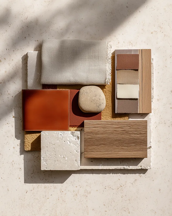
Implementation idea for your home: if you are looking for comfort and a natural atmosphere, these colours are particularly suitable – whether on walls, textiles, or furniture. Combine them with natural materials such as oak, linen, or ceramics to create a calm and harmonious look.
Butter yellow in particular – a warmer, friendlier alternative to beige – is emerging as a new soft neutral. The key lies in pairing it with accent tones and textures. True earth colours work beautifully with natural materials and handcrafted elements, creating a timeless and soothing interior ambience.
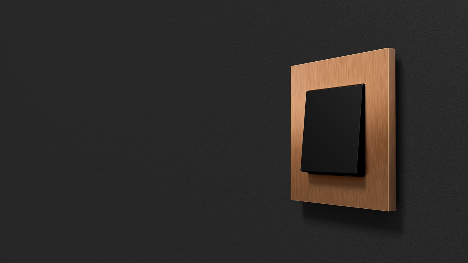
A contrasting accent can be added with the Gira Esprit Linoleum-Multiplex design line. Its matt surface absorbs light rather than reflecting it, creating a clear, graphic counterpoint to warm colours and soft textures without dominating the space.
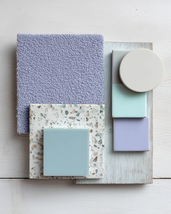
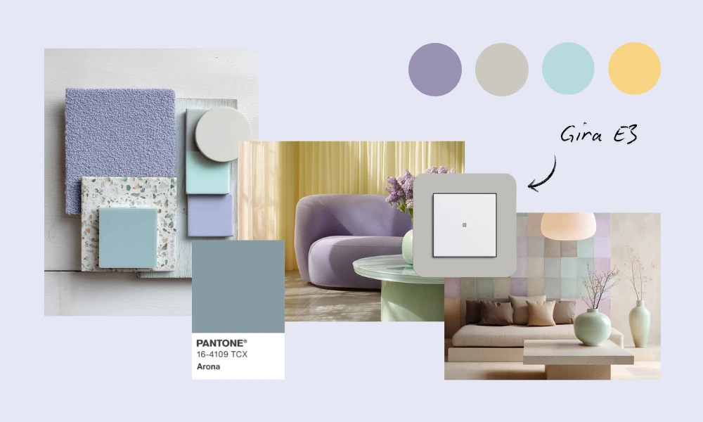
Lavender air and sky blue: bringing gentle freshness into your interior
Cool pastel shades form the counterpart to darker, more powerful earth tones. This palette includes softly tinted, light colours with cool undertones, such as smoky light blue, gentle mint green, lavender, and powdery pink.
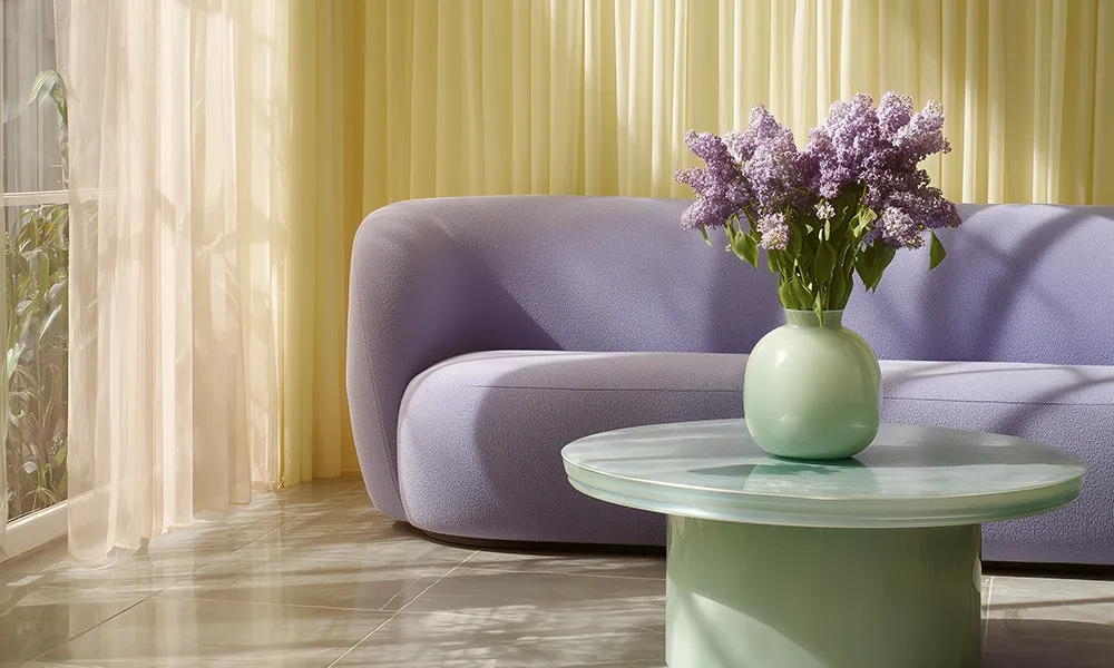
In the 2026 trends, pastel shades often act as a balancing foundation. They bring lightness into a room and add a touch of calm and “poetry” to modern interiors. According to Pantone, the new pastel spectrum ranges from “ethereal, vaporous whispers of tinted whites and lavender blues” to gentle pink tones that create a romantic atmosphere.
These delicate colours work beautifully with natural materials and the neo-neutrals, as they do not dominate but instead create a quiet, calming backdrop. Dulux and RAL also consider soft pastels with cool undertones to be emotional colours that open up spaces rather than overpowering them.
Implementation idea for your home: cool pastels create balance alongside bold trend accents. A smoky light blue or pale green on the wall can make a room feel more spacious and airy, especially when combined with plenty of natural light and white surfaces.
These colours evoke the sky, water, or a veil of mist, providing a soothing effect on the senses. Soft lavender or blush pink – whether as a bedroom wall colour or an upholstery fabric – adds a gently romantic mood without tipping into sentimentality.
The key is balance, so that pastels feel fresh rather than childish. Often, one or two pastel surfaces paired with neutral white, light wood, or grey furniture are enough to achieve a calm, modern look. To complete the trend – quite literally rounding it off – consider the Gira E3 design line in Soft Grey or Sand. With its velvety matt finish and warm tactility, it allows technology and pastel palettes to blend seamlessly.
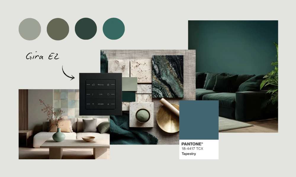
From forest to living room: green and blue shades as a biophilic boost
Nature is a central source of inspiration in the colour trends for 2026. With biophilia gaining influence – the desire to bring nature into the home – it is no surprise that greens and blues in all their nuances play a major role.
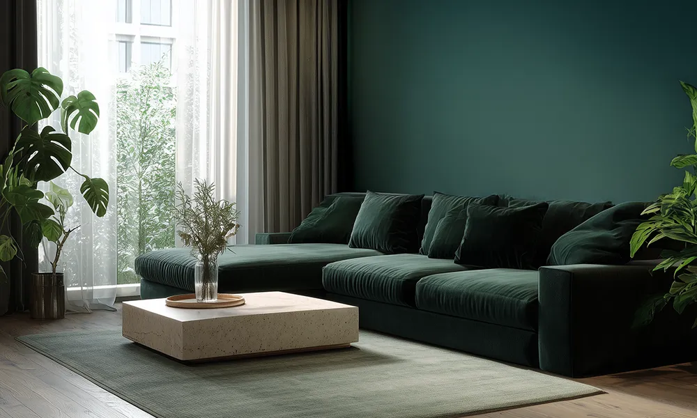
From refreshing plant green to earthy olive and through to turquoise and ocean tones, green and blue bring a sense of freshness, calm, and vitality into a space. Studies show that green in its many shades has a positive impact on mood and wellbeing, offering clarity and a soothing effect – one reason why indoor plants, as well as green wall colours, are so popular.
WGSN and Coloro have even named “Transformative Teal” – a hybrid of blue and green – as their Colour of the Year 2026. This shade reflects a grounded zeitgeist and a growing desire for sustainable living.
Pantone also emphasises in its interior palettes that green is considered “nature’s neutral”. In the “Modern West” theme, for example, muted browns are balanced with green tones. Blue is equally forecast for 2026: deep midnight blue or ocean blue can add spatial depth and is seen as a calming alternative to black.
The NCS forecast “Symbiosis” reinforces this connection. A dark blue, combined with lighter accents, is intended to harmonise people, technology (AI), and nature.
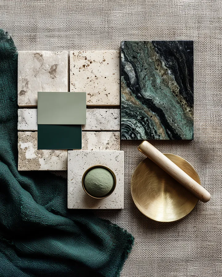
Implementation idea for green living: nature-inspired colours appear in virtually every area of the home in 2026. Green remains a favourite for living room and bedroom walls, kitchen fronts, and upholstery fabrics. Shades such as sage, eucalyptus, or deeper forest greens are especially popular, as they are neutral enough for larger surfaces while still offering a soothing effect.
A soft grey-green wall combined with plenty of plants can transform a living room into a calming oasis. At the same time, we see stronger green and blue accents: petrol and teal tones (such as Transformative Teal) appearing on velvet sofas, rugs, or as standout features on kitchen islands.
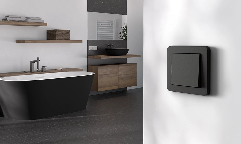
These hybrid shades of blue and green feel contemporary and add a touch of adventure – fitting for trends such as maximalist, tropical interiors. Pantone’s “Exotic Retreat” palette, for example, blends fuchsia pink, violet, and brown with jungle-inspired greens to create a tropical look. The Gira E2 design line in matt black pairs perfectly with this style. Warm wood and linoleum in natural tones complement the nature-driven palette beautifully.
Neo-neutrals: pepper white, olive grey and more as subtle trend colours for 2026
While bold, colourful accents have their place, a neutral foundation remains essential in interior design. However, neutral shades are evolving. In 2026, experts speak of “neo-neutrals” – neutral tones that move beyond pure white or uniform grey.
These new neutrals often feature subtle undertones, such as a hint of beige, green, yellow, or blush, which give the colours more warmth and depth. Rooms retain a calm and timeless feel, yet gain a livelier and more inviting character compared to cool concrete grey.
A striking example is the shift towards buttercream and vanilla tones. Soft yellows are increasingly seen as “the new beige”. Some forecasts even suggest that delicate butter shades will replace grey and beige as the standard neutral by 2026.
Yellow stands for optimism and good cheer. Used subtly as a light shade, it can brighten a room in a friendly way without feeling overwhelming. Warm grey, greige, taupe, and soft white also belong to the neo-neutrals. Pantone’s interior theme “Out of the Ordinary”, for example, combines classic Scandinavian–Japanese neutrals with a selection of warmer, more “unusual” tones to achieve a balanced mix of coolness and warmth.
RAL refers to them as “mediating colours” in its Colour Feeling 2026 report – shades that balance between warm and cool, understated and expressive. This includes several off-whites, beiges, and greys within the new palette.
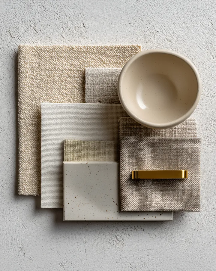
Implementation idea for a modern interior: these neo-neutrals fulfil the same role as classic neutral shades, providing lightness, openness, and harmony within a space. However, they also introduce a stronger sense of comfort and character.
A warm greige or cream white, for instance, can soften the coolness of a minimalist interior and make it feel more inviting. This is why many manufacturers no longer offer “pure white” alone, but a range of nuanced whites with names such as “alabaster”, “ivory”, or “pepper white”, all of which appear softer.
A key element of the 2026 trend colours is the layering of neutrals (layered sophistication). As Pantone highlights, combining warm and cool neutral tones creates a more nuanced, luxurious ambience. You might pair warm beige with cool light grey and a hint of blush, achieving depth without allowing any single colour to dominate.
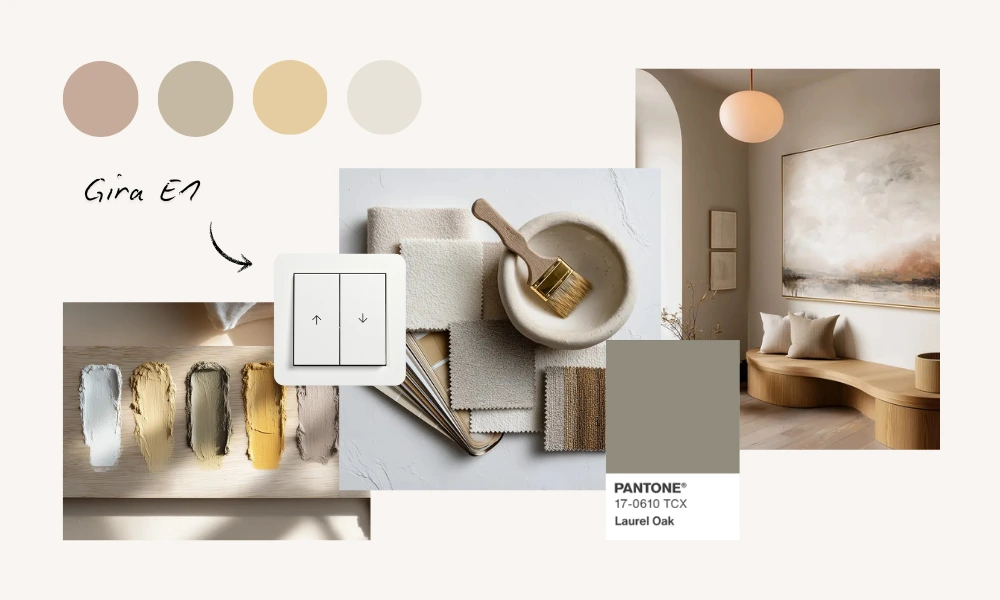
To complement this, the softly curved contours of the Gira E1 design line in pure white matt blend in seamlessly. Combined with butter and beige tones, the design appears as a considered architectural detail rather than “just” a light switch.
Overall, neo-neutrals are designed to make a room feel calm and elegant without appearing monotonous. They create the backdrop on which stronger trend colours from the categories above can be placed with intention – whether it is an orange armchair against a pepper-white wall or emerald green cushions on a sofa in gentle greige.
Trend colours 2026: what is shaping interior design
The interior trend colours for 2026 show clearly how social developments, desires, and design philosophies can be translated into colour.
2024 was the year of emotional softness (“Peach Fuzz”),
2025 stood for warmth and retreat (“Mocha Mousse”),
2026 brings balance, grounding, and visual clarity through colours that offer both comfort and expression.
The colour trends of 2026 combine comfort and creativity. Warm earth tones and neo-neutrals provide a sense of security, casual elegance, and a connection to nature and the past. Cool pastels and nature-inspired shades offer balance, freshness, and an optimistic outlook.
When combined thoughtfully, they create a homely kaleidoscope that reflects central themes of our time such as sustainability, nostalgia, individuality, and the desire for aesthetic renewal.
The result for 2026 is a versatile colour spectrum in which earthy browns, gentle greiges, lavender blues, sage greens, soft yellows, and accents of fuchsia, purple, or turquoise come together to tell one harmonious story: welcome home – in colour.
Gira E1
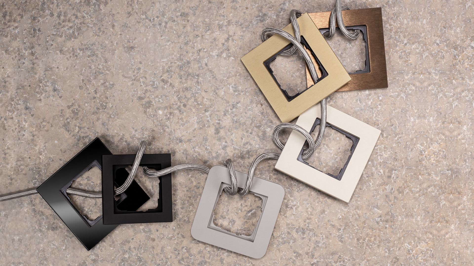
Gira E1 combines simple elegance with versatile customisation options. Choose from five different colours for perfect integration.
Gira Standard 55
The Gira Standard 55 design line is not only elegant, but also particularly low-maintenance: ✓3 shades of white ✓minimalist shape ✓made from thermoplastic
Gira Esprit
Switches from the Gira Esprit design line have a simplistic, yet sophisticated appeal: ✓ various colour shades ✓ natural materials ✓ smart functions.